


Action Plans are a special message type where an advisor assigns the user actionable steps to reach goals. They appear first in the message view when an advisor first assigns them to the user. They also live in a spot in the app called the “cabinet,” where multiple action plans that have been assigned to the user can be stored.
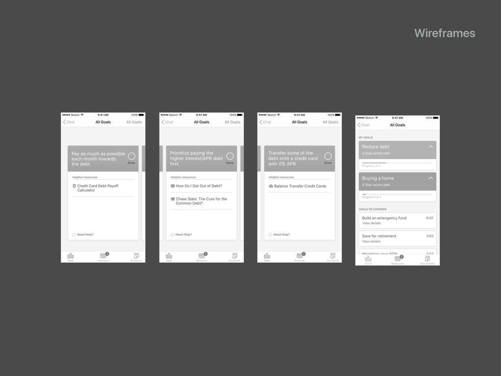
Here are the action plan wireframes I was given by the UX designer in March 2016 to develop visually.
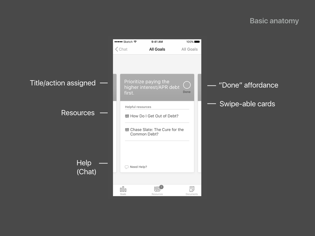
These are the elements that were necessary to include and had been working in the beta.
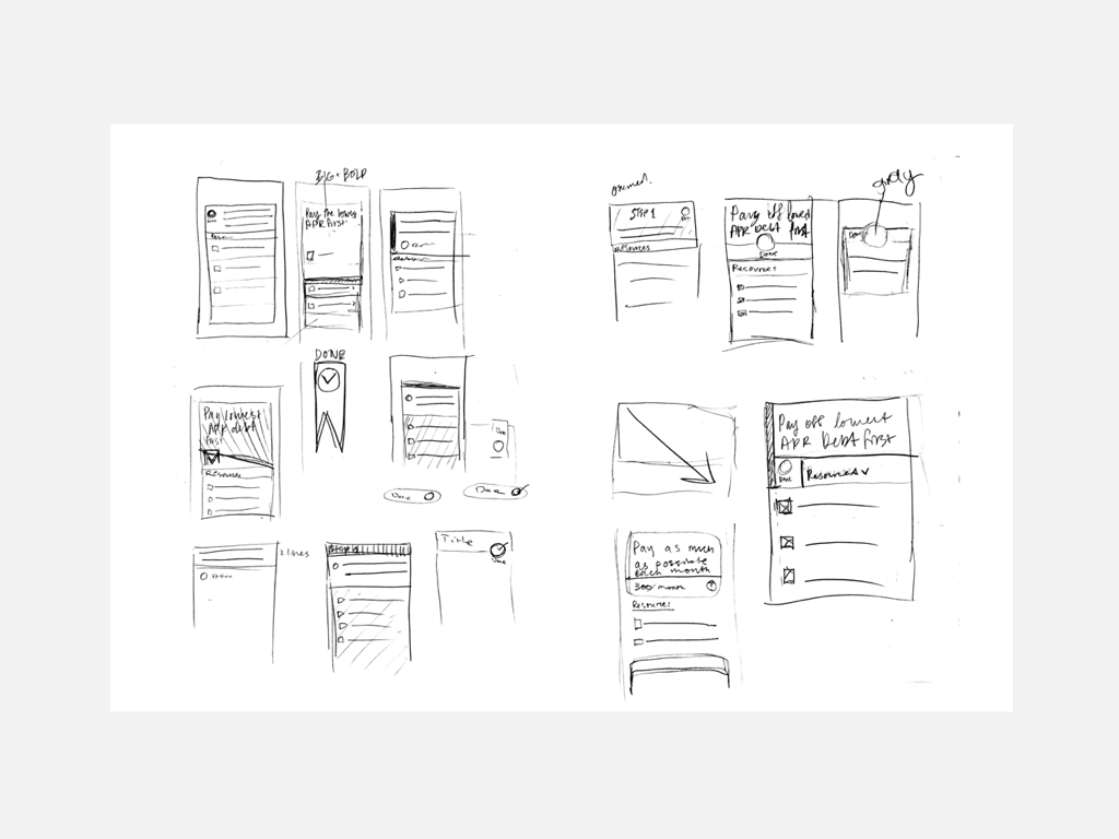
Here I experimented with variations of the necessary elements, such as “done” buttons, colors, accents.
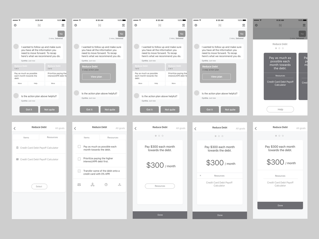
Here is what we shipped to the beta a month later. When a user taps on the message in in the far left screen, they are taken to the sequence of swipe-able cards. The 3 cards can also be accessed from the "cabinet" navigation.
The 2nd screen from right is what a completed step looks like. The far right screen is the user’s cabinet, where their accumulated goals and corresponding action plans live.
Up top is where the character count and # of articles were working as planned
However, though we suggested a character limit to the advisors, we couldn’t control the character counts they actually used and sometimes they did not add articles, which left an awkward blank space in the bottom of the card.
Furthermore, the number of steps in an action plan would sometimes be very long and make the message itself far too long in the conversation view.
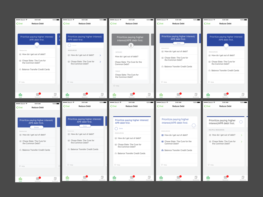
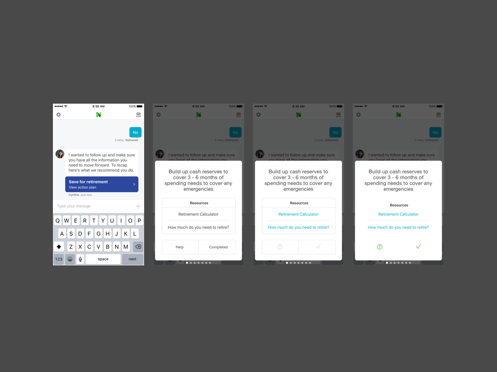
I returned back to the drawing board to find some new solutions. I was looking for something that would not spell everything out in the message view, but be more of a link to an overlay or other screen to see the steps.
Experimenting with overlay over the message.
Swipe-able action steps as previewed in the message view.
Experimenting with tabs for goal steps vs. resources
This is the first iteration of what evolved into the solution.
A message type as a link, turning into an overlay that was vertically scrollable and allowed for limitless steps and character count, if need be. To the far right is what a completed action looks like when you’ve completed all the steps.
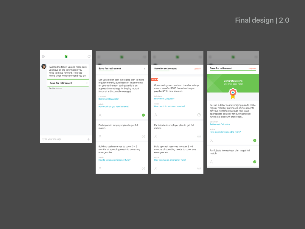
This was put in the engineering backlog but due to short engineering resources, it was never built in the actual app before it shut down.